Your conversion rate, the number of website visitors who take action, is the final metric that matters–the one that validates all your other efforts. Here are 20 easy-to-digest, practical tips, proven to help you boost conversions by as much as 200%. Adapt these ideas to fit your business and get the greatest possible return out of all your marketing efforts.
1. Test options for the call to action.
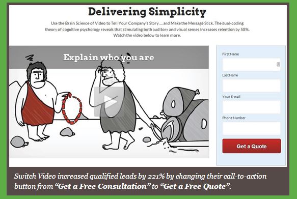
A/B testing is essential to finding the reasons behind low conversions. Changing parameters one by one in a controlled environment will give you a microscopic view of how potential customers view your advertisements and any landing pages. Adjusting the call to action by as little as one word can make all the difference.
2. Create alternate headlines to test conversions.
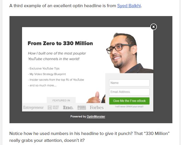
The most important aspect of any ad is the headline, and you need one that catches your target audience’s attention immediately. You can test different keywords, orderings, and lengths to find the optimal structure. Keep in mind that your headlines may need to change as new trends and terms hit your industry.
This great example from OptinMonster’s “63-Point Checklist for Creating the Ultimate Optin Form,” shows how to convey one short, simple fact to make your point and generate a response.

3. Test different ways to layout your page.
Do you need shorter text blocks, more pictures, and text markers that will point to your main contentions? Give your page a few different layouts to test how people respond and get a better handle on how to organize your online sales pitch. Keep detailed data on the types of changes that work, and make a template from them.
4. Devise an offer to test.
Smart businesses create sales offers as a loss leader; smarter businesses create sales offers as a test campaign to form a template for future ads. If you can look at hard numbers on a product or offer, your findings will be that much more useful and timely. The very smartest businesses place the offer in a format that is most likely to trigger that response rate you need.
5. Reduce the need to scroll.
If the main point of your website is “under the fold,” as the parlance goes, put it higher on the page. As people scroll down a page, they read less, and no customer should ever have to scroll onto another screen in order to get the point of your web page. This includes your call to action, which should be everywhere, not just at the end of your pitch.
6. Cut out useless A-V.
If you have pictures or videos that do not directly correspond with your main message, get rid of them completely. Audio and visual cues are very powerful, and if they direct your audience away from the main point of your site, you will leave them with a very confused outlook, one that will not create any urge to buy.
7. Test your website conversions before testing its pages.
This is just another way of saying that you should test different whole versions of your website before drilling down into the minutiae of split testing. You need to have an overarching idea that works before any detail will matter.
8. Pay attention to your 404 page.
Just because people find their way to a 404 page from your site, it doesn’t mean that they should bounce away from your jurisdiction. Customize the 404 page to lead them back into your fold.
9. Exit intent popups work, but watch it in the mobile space.
You can retain some of the 70% of people who would otherwise bounce away from your site with an exit intent popup, but Google has begun to punish sites that create these popups too liberally in the mobile space. Keep it confined to the exit and check Google guidelines for acceptable size and other specifics.
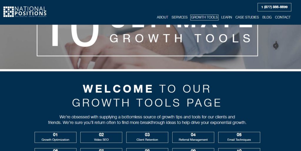
On website pages, use a floating bar to keep search access handy for visitors as they scroll down. They can instantly click through to explore another page without having to scroll back up, or they can reply to your call to action when inspired (in this case, our phone number).

10. Back up your company pitch with studies.
People love case studies, even if they do not read or understand them. You gain credibility if you can identify the Harvard study that backs up your product, even if your target audience never reads that study.
11. Don’t be afraid to give away information.
Companies shoot themselves in the foot trying to hold back information, thinking that giving too much of it away will cannibalize sales. Relax. People don’t want to actually do it on their own. They just want to be sure that they are leaving their problems in the hands of an expert.
12. Make your watchdog seals more prominent.
If you have certification from a third party industry watchdog, make sure people know about it. These seals of approval give an instant check to the objection of safety or viability, as well as to any buyer’s remorse.
13. Speak plainly.
In some industries such as medicine or law, professionals lose customers by trying to impress them with industry jargon. You will gain more customers if you speak to them in their language, because people instantly click away from content they do not understand.
In his Definitive Guide to Conversion Optimization, Neil Patel shows a clear and simple example of what this can do for your conversion rate, below.

14. Use the second person.
The second person “you” is the most informal type of address, and it has been shown to draw in customers–for very good reasons. When you talk to your customer directly, you are seen as more in tune with their needs, more engaged with them.
15. Use authentic video and imagery.
Don’t bother paying a premium for those mostly-cheesy stock images, they rarely have the effect you need. Better to take your own pictures and shoot your own videos. Authenticity has much greater impact than perfect production value.
16. Create a sense of scarcity.
You can create a powerful sense of scarcity with some carefully chosen wording. An example of this might be, “we only have a few of these left in stock,” or “limited time only!” You can also invest in a countdown timer, to add a more urgent sense of time passing. There are many templates on the web for these timers, so you don’t have to know how to code to make one. If this seems like an old idea, that’s only because it continues to work so well to motivate so many people–human nature doesn’t change all that much.
17. Give your customers a payment plan.
If you are a luxury brand, this may not be an option. However, if your product is a relatively expensive staple or mid-tier brand, you should offer as many payment options as you can for your customers. You may actually turn this into a separate income stream if you make money on interest from your lines of credit.
18. Make sure your information is accurate.
People may read more of your website than you think, especially if your brand is relatively unestablished. Do not mistake putting your CTA above the fold as an excuse to fill up the rest of your website with junk. This is the fastest way to a high bounce rate and a low conversion rate. This is also the reason to shorten your content in total. The longer your pages, the more likely it is that you are talking your site visitor out of becoming a customer.
19. Optimize your most popular pages.
As you conduct your A/B tests, you will naturally find that most of your sales leads are coming from clickthroughs on certain pages. They may not be coming from the initial landing page, but once the data shows which is the most popular, you need to fully optimize leading pages to ensure they produce the most possible conversions.
20. Rely on your data, not on your own opinion.
As you test all of the tips above, rely on data over everything. Do not introduce your personal opinion if you don’t need to. Turn to the many analytics platforms that are accessible to everyone, especially Google Analytics, to decide on your next course of action.
Bonus Tip.
Expand your conversion rate and optimize for consistent growth with expert help from National Positions. We harness analytics with testing and apply our team approach to help you drive ROI. We know you work hard to get those visitors to your site, and we want to make sure you convert more of them every day.