 Welcome to part two of our podcast (and blog) all about conversion optimization tips, tricks, tactics, and strategies for the holiday season and beyond.
If you missed part one you can click here to see what you missed from part one, but if you are feeling brave and want to start from here, we respect your gusto!
When we left off with CEO Bernard May and Marketing Director Matt Erickson, we had just begun unpacking the need to use Google Analytics and get comfortable with the data. But this is looking at conversion data from a high level (or macro) view.
We are picking things up with how to understand how customers are using your site and being able to literally see where you can improve your user experience. Let’s pick things back up and see where this conversion conversation will lead. Grab a pen, paper, and some popcorn!
Leveraging Conversion Toolsets
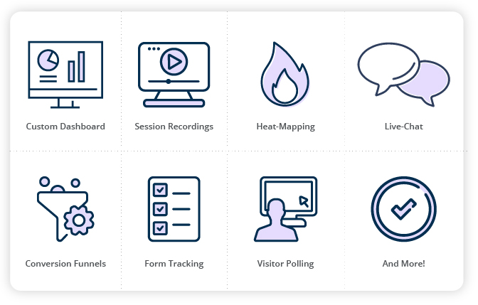
Bernard May: Yeah. I love these tools. We have something at National Positions called the Conversion Growth Pack, and it, as you said, it might even sound a little bit like science fiction itself, in that you can actually watch users live interacting with your website.
So, if you are concerned about a particular kind of device, how you’re doing on mobile devices versus desktop, and where people are actually getting stuck on a particular page, where you’re seeing the most attention, how far people scroll down the page, those are all things that I love looking at in these heat maps and trying to get an idea of why people are having problems.
And you see this often that there might be someone who’s just clicking on the menu on their mobile phone, which means that they’re finding whatever is on this page not particularly appealing, or they’re not scrolling down to the most important information.
Bernard May: So, what you’ve got to do is you’ve got to push that information towards the top of the page-
Matt Erickson: That’s a great one.
Working “Above the Fold”
 Bernard: Above the fold is so important. And this is an old term that came from newspapers, but literally, it was the information that you would have that you see first without scrolling. And these are really, really important.
And you want to see where people are clicking and not clicking. I’ve seen instances where people are clicking on an image all the time, thinking that that image is clickable and they can go somewhere else. And other areas, I’ve seen where we have a link or a button that people aren’t clicking at all because they didn’t even see it as a link or a button.
Matt: Both of those can be, for example, two things you really hit on.
That thing that you just said about if you’re seeing there’s a lot of heat going on at the top, and then not very much in the middle, but towards the bottom, you’re getting all this look.
 Maybe you have videos that are showing testimonials and people’s stories, like, okay, that you definitely need to move that higher up because that’s higher value.
That’s going to help their conversion decision. But if someone, let’s say they’re clicking an image, for whatever the reason may be, well, that may be a perfect place to put a video now.
Matt: Because if people are trying to click it, well, something’s making them want to do that, whether maybe it could say like see it in action and you mean for them, like Bernard said, you have to have a link to a video, just embed that video, and that’ll keep them on the page longer, which will help your ranking, can probably help conversion, and help a whole myriad of other things.
The Conversion Growth Pack
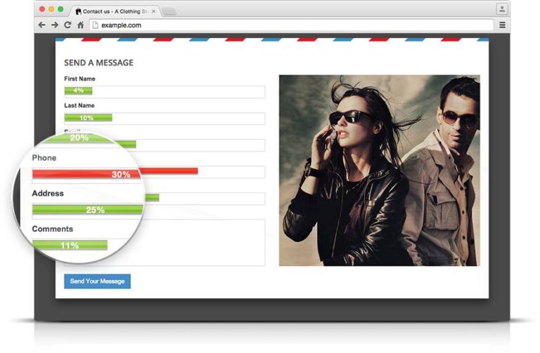 Bernard: There’re a couple of other areas of at least our Conversion Growth Pack that I like as well that I thought that users might be interested, or listeners might be interested in, which is form analytics.
A lot of people have problems on forms. We get this question all the time, “Should the form be very long? Should the form be short? What should I include? What shouldn’t I include?” That’s a lot of what you see with form analytics. I don’t know if you’ve seen anything cool or interesting on that tool.
Matt: Forms are not, I will say this because I spent a lot of time in forms, and it’s amazing that… I mean, the simple answer as far as forms go, or there’s, well, two. One, shorter, the better, only because, like Bernard said, our attention spans are just not there, but that also does depend on who your audience is. If you’re a B2B audience, or a B2C audience, B2C is going to have the more of the goldfish.
Maybe the B2B will have (the attention of) three goldfish.
But it’s definitely something that if you’re, let’s say you’re a local cleaning service. You do come in, you clean homes or apartments. That stuff, you’re going to want a shorter form, you’re not going to need name, best time to contact, contact email, and maybe one other. You don’t need a whole lot.
Matt: But if you do have, let’s say, a B2B tech stack or something, that’s when you start seeing things like, of course, the name, phone, email, that stuff, but then you’ll see, “What’s your industry?” And there’s like a drop-down to different industries.
Even once in a while I’m doing research, and I’ll come across some site, and there’s a form that has seven or eight. I mean, it takes up most of the fold, and I just kind of like, “Who’s filling this stuff out?” Because I know I wouldn’t.
That’s not just because I’m in marketing, that’s just because I don’t have that kind of time to sit there and fill all these things out. So, you can definitely, if you’re watching forms with this tracking software to see what’s performing, this is also a big part of doing A/B testing or multi-variant testing on your landing pages to see… And you can always do this on the same page.
Matt: You could have a page that has a button right at the top, “Book your appointment now.” Click, and it brings up a lightbox. Okay, that’s one kind of form. It’s a lightbox form.
Well, then further down, you may have an in-page form with either the same amount of information needed, or maybe one more or one less.
Okay, well, now you’re testing two forms on the same page, but they’re also different styles and different sizes. And then you maybe can have one in the footer that’s just, “We’ll contact you,” and it’s very, very short.
So, those are ways that you can test forms, but also layering on this kind of software that Bernard’s talking about, what the National Position was…
Matt: I want to say, the analytics dashboard, wrong one, but with the technology we use, you can test all those forms at the same time and see, “Okay, wow, the lightbox, one that only had four prompts, it’s much, much better than one that’s in page. But that has six.”
So, there’s definitely a testing process with that, to make sure that you’re not scaring away any potential clients, but also that you’re getting the information you need to actually make it worth reaching out to the client and you’re not just filling your inbox with leads that aren’t going to go anywhere.
Optimizing Site Forms
Bernard: Yeah. You bring up a lot of good points. The thing that I see a lot with form analytics is that people build their websites for desktop, and then on the phone, there’s a dropdown. And I’m sure we’ve all run into this before.
We can’t understand why you aren’t able to fill a particular field, and it’s because it’s a drop-down. And drop-downs are actually really difficult to handle when you’re using a mobile device.
For instance, one of the tricks, instead of asking someone for the address, you just ask them for their zip code, and then from the zip code, you can fill out automatically what city they’re in, and what state they’re in, without having to ask them for city and state.
So, those are the types of things considering mobile first. Another area that is helpful is the surveys, is to have live chat and having surveys, “Why are you leaving the site?” Just before people leave, or, “What is your experience on the site?”
And obviously send that to a few people.
Split Testing Landing Pages
 Bernard: But to get that type of information back, it’s relatively inexpensive, if not free. And then, with live chat, why are people actually asking questions? Is it because that information isn’t on the website? Or for some other reasons.
So, those are all things that… So, now we’ve gone to analytics, then we’ve gone into this Conversion Growth Pack, and then the last part is really deciding now, we figured all this out, which experiments are we going to be implementing?
And you had mentioned before, this idea of split testing or multivariate testing, I don’t know if you want to tell the audience a little bit about what the difference is and which one they should choose.
Matt: Sure. I mean, the basic version, and I’m going to very much simplify this, when you get into testing, it becomes like a spider.
There are so many things you can do.
But split testing is the, you may have heard A/B testing. That’s the idea of, you’re taking more or less one element of a page, let’s say it’s a header image, and you’re using two different header images, everything else is the same on the landing page, and then you’re allowing Google Analytics, let’s say if you’re doing a PPC campaign, you’re allowing it to serve up those pages, and you’re going to see which one is getting better results.
Either that could be which one had more conversions, which one had more time spent on it, which one had a lower bounce rate, whatever it’s going to be, to find a winner. That’s just a basic split test. You could do A/B/C, you could go on, you could make it bigger.
Multivariant Testing Landing Pages
 Matt: But you’re testing usually one or two variations of a page, and you’re changing one or two things.
Multi-variant starts getting interesting because now you’re multi, many, variant, variations. So, you’re testing many variations, and often can be several different elements at the same time.
Just one example of this could be… One of the problems that we see this happen is, if someone says they want to do a split test, and they have two pages that look completely different, completely different, different copy, different form, different everything, well, now you can’t compare anything, because you don’t know what’s going to have the effect.
Was it the image? Was it the copy? Was it the form?
Matt: So, multi-variant, I think a good way to approach that is stacking, because if you stack changes, for example, let’s say you have, page A has image this, page B has image this. Cool.
Page C has that variation of the image, and now has a button below the headline. And then maybe the fourth version has everything the third one did, but you’ve added live chat to that page now.
Something like that. So, again, there’s… Go ahead.
Bernard: No, no, in multi-variant testing, of course, it’s almost exponential. So, if you’re testing two or three or four elements, you’re looking at exponential.
For instance, you’ve got three elements, you can have nine different variations. You’ve got four, you’ve got 16 different elements that you… The tools that you’re using to do the experimentation can actually show the results.
It needs a lot of traffic to get to a statistically significant result. And usually, that is only something that I recommend if you have a much bigger website with a lot of traffic. And that’s a key. Most people are doing split testing, and the big question then is, what do you test? And I’ll just throw out a couple of things.
Where To Begin Testing?
 Bernard: So, you could have a checklist, your navigation, your products, your pricing, your testimonials, your calls to action, your website layout, your return policy. I mean, there’s just so many things that you could be considering when doing a test.
So, where do you start?
Matt: That’s a big question. One thing is this, is that if you… Two things, because there’s two things.
A, if you have never used the landing page, I’m considering this from a straight paid media standpoint you’re on, like Google search or something, if you’ve never done that, don’t.
You have to give it time, like Bernard said. You have to have enough traffic coming to this page so you can try to figure out, “Okay, what works? What doesn’t?” But the first thing, like Bernard was saying, there is a checklist of, A, your images, your videos, your aesthetics, the goal you have, the offer you have, the forms you have. Are you asking? Do you have calls to action?
All those things, just to make sure you have all those basic things.
Matt: And then from there, the easiest thing to change between the first time you’re testing things is the imagery, because the imagery, it takes down, I’ll say, less time, but writing copy, and burping copy, and thumb-stopping copy, it takes a lot of time.
So, the first thing that I would be doing is I’d be testing the imagery. I’d be testing the imagery from one to the other, and letting that run for at least, if, again, if you’re a smaller business, I mean, at least two weeks. And also, okay, if you don’t have a budget, that’s a problem.
We’ve had this before, people say, “I’m going to spend $200 on Google Ads.” “Well, okay, a day?” “No, no, no, for the month.”
Matt: Okay, but if it costs $5 a click, you’re not even getting into the hundreds of people visiting these pages to try to figure out what works and what doesn’t.
So, that’s the first thing. And so, if you go images, and then you can go headline copy, then you go forms, but you need to have that listed out, like, “What am I going to be testing? This, this, this, this, this.”
And every time you get a winner, let’s say you do the image test and people have spent 20% more time on this imagery than that imagery. Okay, you’re going to take that page, you’re going to duplicate it, and now we’re going to take that and we’re going to add in a call to action under the headline, and we’re going to move the form higher up on the page.
Okay, now we’re going to test that for another two weeks or a thousand visits or however long.
Give Your Testing Time
 Matt: So, the short version is how you figure out what to test, slowly and deliberately.
I totally get that it feels like money is just draining away, but it’s kind of like if you’re trying to work out and trying to get more healthy, and you try to change your diet, your water intake, your weight lift, you try to do everything at the exact same time, you’re going to fail, because you need to grow into it.
So, I mean, that’s where I would start personally.
Bernard: Yeah. I think, just to add to what you’re saying, some of the thoughts I have on this is, understanding, and we ended up going full circle, one of the first things you said was, make sure you understand the user’s intent.
So, if the user is coming in and they’re looking to find out, let’s just say it’s a LASIK surgeon, and they’re trying to find out, what is LASIK surgery? How expensive is it? How painful is it? How long is the recovery? Then you need to answer those questions.
So, I always go back to like, what were you trying to do? And I guess it goes back to the goal setting as well. Sometimes I find there’s a lack of congruence between where the traffic’s coming from, and what people were expecting on that particular page.
So, go back and then using all of the elements. We’ve used analytics, we’ve used heat maps.
Bernard: We understand where people are clicking or not clicking, where items are below the fold or above the fold, whether it’s a mobile device or a desktop query, and then making those decisions that I think it’s hard, because there’s a lot that you could test.
The biggest mistake is testing too much, exactly what you were saying. 100%, Matt, agree with you on, that is a rookie mistake, is going in and making hundreds of changes, because then you never know what actually improved.
If it does improve, you have no idea what improved it.
But it’s really going back to that functionality we were talking about before, it’s like, what do people care about? Where are they in the funnel? Are they at the top of the funnel asking those LASIK questions that I gave? Or are they ready to buy?
I think so many times, I find that pages are designed around, I’m ready to sell something to someone, it’s all about me, as in, the company, and not about the users.
Adopting the Customer Mindset
 Bernard: And it’s really deciding that there is a point where you have to ask for the business, just like you do when you try to sell someone in person. It’s like, how do I build the relationship? How do I get people to come back?
So, yeah, I think you brought up a lot of really, really great points there.
Matt: And this is where you see a lot of early risk reversals, where there’s like, again, I come back to the workout site, “Are you ready to be healthy? Are you ready to be the best you?” Not like, “Are you ready to join our team?”
It’s about them, it’s not about you.
Why is it about them, everybody, all the time? Because, well, at least in this country, we live in a very need-dominated world. So, it’s, “How fast can I get it? How quickly is this going to work for me?”
So, it is important that your language does reflect that, and bringing this back full circle, if early in your Google Analytics research, let’s say you, like Bernard said, this is for everybody. Well, yeah, being healthy may be for everybody.
Matt: But you may find that in your digging in your research, that in your demographics, “Wow, 68% of the gender split coming to my site are women.”
Okay, well, maybe you need to tone up your landing page with the proper imagery and messaging to hit the pain points that matter for that demographic more than everybody.
So, you’re right, Bernard, it does come full circle with, starting with that data, and then all the way down.
Conversion Base Hit or Home Run?
 Bernard: And you brought up a great point about knowing your audience, and it goes back to that intent area. I think one of the other mistakes that people make is they feel like they should get a home run every single time.
And what I mean by that is, there are many situations, especially with a complicated product or an expensive product, where you want to take those hits. You want to get a base hit. You want to get them to give you their email address, or you want them to click on a particular area, or download a particular document, and then go and get them to come back.
And a lot of that is by giving things away, for instance, making sure you’ve got those marketing magnets out there, and that you try to build that relationship.
Bernard: And I see that over and over, where people, they don’t understand why they don’t have a better conversion. And that’s, again, because they’re not building that relationship.
I know we’re running a little out of time, so, I want you to… and this is such a fascinating subject. I know we could continue to speak about psychology and pricing, because I know you could take everything that we’ve spoken about now, and if your pricing is so out of whack and you haven’t actually looked at your competition, or you haven’t built the value, you’re just not going to get the conversions.
And I’ve seen some wonderful sites where the pricing is so out. But I thought maybe it’s time to summarize some of the findings as we wrap things up. And, Matt, thank you so much for all your wonderful input, is that conversion optimization is a long-term strategy.
Bernard: It’s not something that you just do, and then you forget about it.
It’s something that you should be building into your process. And every single month, going through that methodology that we said, okay, you’ve got a checklist of different items, you need to understand what the intent is, you need to really be there understanding Google Analytics and what Google Analytics is telling you, then you’ve got to dive into your conversion tool, whether it’s Lucky Orange or Hotjar, or National Positions conversion best practices…
…and just dive in there, look at those videos, understand the heat maps and the form analytics, and then take those actions, put in those experiments, split test, and I know that sounds really easy as a formula, but it’s actually obviously quite complicated, and there’s quite a lot of art to it.
What You Should Take Away
 Bernard: But I was wondering if there was one thing that you would want our listeners to take away today, what would that be, Matt?
Matt: Wow. I think that one thing, coming from spending about 10 years in the industry, is, check your ego at the door.
It’s a painful process, because what you’re basically asking when you’re doing conversion testing and optimization is to go, “Okay, where did I fail? Where did I go wrong?” And once you accept that and go, “Okay.”
But that’s, again, that’s the only way we get better is if we know where we screwed up. And, again, I think, not seeing it as, “I failed,” but just, “I didn’t know what I know now.”
So, constantly re-evaluating, gathering new information. I mean, come on, if every campaign was a home run, there would be no marketers in the world. No one would need us.
Matt: But that’s the thing, is that, if you’re trying to marry the, when it comes to conversions, it’s that mix of the psychology and the data, and it’s, every time you run a campaign, you’re going to learn something new, just worry about now, not yesterday, and just keep moving forward and testing one thing at a time. You’ll get there.
Bernard: So, I guess the two takeaways, check your ego at the door, I couldn’t agree with that more. There’re so many-
Matt: And we’re all guilty of that.
Bernard: There’re so many CEOs that build the website, they feel that they are that ideal customer, when they’re not, the CEO of the company, but they choose the colors, they choose the calls to action, they critique the website and make it in their own image in a way, where it’s really, listen to what you’re seeing.
You actually have a lot of tools out there that you can take advantage of, and then constantly be testing. So, that was Matt Erickson, Director of Marketing at National Positions. Thank you so much, Matt, for joining me today to talk about this absolutely fascinating subject, conversion rate optimization, it can have such an impact on your business, and it can really multiply your sales and your success online.
Bernard: Thank you again for joining us for another episode, another podcast of the Digital Breakthroughs, and I hope you’ll tune in again for our next podcast. Thank you again for joining us.
Going Conversion-First in 2021
 Wow, that was a lot of information. But what it all comes down to is the concept of conversion needs to be the guiding light for all of your marketing initiatives. These may be micro-conversions like getting someone to click on a video or a “buy now” sales conversion, but you need to be driving action.
Set your goals, track your progress, learn to love the data, and make sure you never stop testing.
As always, National Positions is here to help if you need some assistance. We can even provide a full conversion analysis for you so you can see at a glance where you have the best chance to improve conversion faster. Email Marketing@NationalPositions.com to book your free analysis before 2021 arrives!
Keep conversion at the core of everything you do with your marketing as you move into 2021 and beyond.