Can you believe that the holidays are right around the corner?!
And we all know that the holiday season is something that families, shoppers, and businesses count on to make the year in the rearview mirror all worthwhile. With this in mind, National Positions’ Digital Breakthroughs podcast decided to dedicate Episode 9 to conversion rate optimization.
Basically, if you could double or triple your revenues and profits without increasing your costs, would you do it? Yeah, so would we! That is what we mean when we say “conversion”—how can you convert more site visitors and ad clicks into paying customers?
Let’s get into it and find out what you can be doing to improve your conversion and profits for the holiday season and beyond!
Bernard May: Hello, everyone, and welcome to the Digital Breakthroughs podcast. Today, we’re going to be talking about conversion rate optimization with Matt Erickson. He is the Director of Marketing here at National Positions, and I’m really excited about talking about conversion rate optimization.
Conversion Rate Optimization
Bernard: Conversion is one of those areas that can have a massive economic multiplier on your business, and can identify surprisingly profitable areas that can really transform your business. And I feel like this is one of those areas that’s near and dear to my heart, it’s one of those areas that just isn’t well handled by so many companies, and I think today, we’re going to uncover a lot of areas that I hope will create that spark of insight, of excitement, and everyone’s going to find this information actionable, and they’re going to jump right into it.
Multiplying Success
Bernard: So, we’re talking about these multipliers, and before I jump in with Matt, I just wanted to give you an example of the power of conversion. Let’s just say you’re spending $2,000 a month on internet advertising, and you’re generating, say, 5,000 visitors with 1% conversion rate.
I know I’m throwing out a lot of numbers yet, but if you take a 1% conversion rate with 5,000 visitors, you’re going to end up with a total of 50 conversions, and your acquisition costs would be $40. Now, let’s say we keep that spend exactly the same, we keep the $2,000 a month, and we’re generating those 5,000 visitors, but your conversion rate goes from 1% to 2%.
That means you’re going to get 100 conversions, and your acquisition cost will go down to $20. And that’s really, really exciting.
Fueling Higher ROI
Bernard: So, all of a sudden, you’ve got 100 conversions, just by doubling up your conversion rate. But this goes much further, and a lot of the excitement around conversion is the lifetime value of those clients.
So, now you went from having 50 conversions, say, 50 clients, to 100 clients, and you have an opportunity then to go out and sell to each of those clients over and over. So, that was a long intro, but welcome, Matt, good to have you here today to talk about conversion rate optimization.
Introducing Matt Erickson
Matt: It’s good to be here. It’s been a while, and it’s definitely a subject that I think most people assume that marketing conversion is just part of it, and it’s definitely something that you have to dig in to realize that more is not always better.
And if you understand that, conversion is sometimes the missing piece of a puzzle, you really have to look inward on your brand to figure out, “Oh, what am I doing right? What am I doing wrong?” Which can be a little tough to take sometimes, but if you’re trying to be more profitable, that’s definitely not something you can overlook. So, thanks for having me again, it’s always good to be back here.
Why Websites Fail
Bernard: Yeah, I think let’s start out with discussing an area as to why a lot of websites are failing out their way. When I say failing, maybe just not achieving what they really should be achieving when it comes to the opportunity that they have out there, and I was wondering if you had any thoughts on that.
Matt: Yeah. I mean, I think when it comes to just websites specifically, it really comes down to, before I go into what people, I think, people should be focusing on, websites are kind of that labor of love, and a lot of brands, especially younger brands, they put a lot of time into it at the forefront and they went, “Okay, that’s good. Set that, forget that, and work over here.”
So, it may have been fine two years ago, it may have been fine six months ago, it may have been fine before COVID, but now they have not really kept up with what the demand is of what people want, what’s going to make people’s life easier, what’s going to make that user experience better, to reduce the friction points that come into conversion.

Matt: So, that’s the broad part when it comes to websites. But, I mean, specifically things that people should be looking at are the usability of their sites.
Is it easy to navigate? Is it easy to understand what you do, what you sell, what your value prop is? And is it easy to do this on per device?
I’m working on a Mac right now, but if someone’s on a PC, or someone’s on a specific mobile device or a tablet—it’s important to remember that that experience that’s going to help people convert easier is going to sometimes be dependent on what device they’re using.
So, you may think your website looks fantastic, and it does work flawlessly on your desktop, but if 80% of your traffic is mobile, you may be missing a big, big, big, big piece.
Matt: That’s just the user experience side, of course, you have your visuals, your messaging, your content, your aesthetics. I think the thing I’m seeing most often is, people are working so fast, because everyone knows they have to get their ecommerce up and going, but they’re missing the clarity.
It sounds very basic, but it’s like, “This is what we do. This is how our solution is better. This is how we make your life better.” And just doing that in a very streamlined way. That’s just scratching the surface on how to start making your website convert.
The User Experience

Bernard: Yeah. I think one of the areas that you brought up, which is so important, is all about user intent, user experience. Now, if you don’t know what your user looks like or who you’re trying to attract, I think that really is the number one pitfall. And starting out with that idealistic visitor, who they are, what they care about, even down to how they navigate, how sophisticated they are with technology.
Matt: Something you just said there that was really, really important, which was, you said, “Who you’re trying to attract.”
And I have this thing, I heard it a long time ago, don’t remember where it came from, but it’s that if you’re trying to appeal to everybody, you’re appealing to nobody. If you’re trying to get, “Oh, we just need anyone,” it’s like, well, then you don’t really know who you’re trying to market to, which is a problem.
Bernard: Yeah. So, that comes down to also segmentation. I hear this all the time, “My product is something that appeals to everybody.” That’s great, but that is, I think, one of the most fundamental errors that people make is that they go in there and they decide that the product’s for everyone.
In fact, what you really should do is go in and understand what we call the personas or the idealistic view of who you are out there marketing to, actually write that up and have that in front of you when you’re designing a page, when you’re writing the content, when you’re thinking through what people really care about.
Because I think that if you do that, you’re going to build around that intent, and you’re going to really hit on the needs of that particular client.
Function over Aesthetics

Bernard: I think one of the areas I see as a real problem is you come to a website as well and you really don’t know what it’s all about. And you’re not really getting in there and answering the needs of what your particular ideal client base is looking for. I don’t know if you’ve seen that.
Matt: Yeah. I mean, I’ve definitely seen that people are trying to be, I was writing that thing before and I was writing, “Less sizzle, more steak.”
They’re trying so hard… and I get it, every brand is doing this unless you’re already established, you’re trying so hard to sound cooler, to sound different, or to sound… but then it’s three scrolls down before you realize, “Oh, you do virtual workouts. Got it. Okay, I understand now.”
But who’s going to wait that long? If someone, with all this COVID stuff, which I understand, I’m in the same boat, if you’re trying to work out at home, and you’re like, “I need to find someone who can do Zoom workouts.” And you search Zoom workouts and you get a CrossFit gym, but it’s not calling that out at the beginning, “Workout at home on your schedule.”
Matt: If it doesn’t lay that out, it can confuse someone very quickly. And you may have taken that into account in your content further down as an add-on, but you need to pay attention with your personas, what matters now, not what mattered before, what’s going to hopefully matter six months from now.
Bernard: This is principal I’ve heard, and it says that top companies design for function, and not aesthetics.
And I think that goes to what you’re saying as well, is a lot of people are trying to be cool and they’re trying to put… I see a lot of headlines out there that if you really removed the headline and you… Sorry, if you really removed the images and the colors and all the other aesthetics around that, you’d be like, “What are they trying to say? What is this?”

And there’s this thing about being functional and really, I think Amazon is an example of that, where they have taken over the years, if you look at Amazon’s website from, say, a decade ago, even 15 years ago, it’s not that different, but they’ve made small little iterations to make the site as functional as possible that when you get to a product description page, that page has got absolutely everything that you would need to make a decision whether this is a good product or not.
Matt: Absolutely. And they also, something that just popped in my head is that they went spending years figuring out, “How do we make search better, finding what they want better?”
And then the last five years, four years, maybe even less, they pivoted into, “How do we help them discover better? How do we help them?” We saw this, we’ve all seen this, where we buy a product and people usually bought this with this, but now you open that homepage and it’s got, “Gifts for him, gifts for her based off your previous purchases.”
And so, you may have even gone in to look for a specific thing, and you’ve started going down the rabbit hole of… And we don’t not like it, we like it. Because if people didn’t like that, it wouldn’t be on Amazon. They would have tested it for six months and said, “Okay, the beta didn’t work, we’re going to remove it.”
Matt: So, I think that’s definitely, you hit it on the head where it’s like, let’s just go back to the workout thing because I’m always interested in that, if you have a site, you may be trying to promote a very team-oriented, family-oriented whatever, but if your head image doesn’t show someone sweating and working out, they may think, “Oh, it’s a support site.”
They may not understand that it’s an actual workout site. So, I think you’re right, if you can cut things down to the bone, and if it doesn’t add, it detracts, and then you can put some sprinkles on top of that.
But, like you said, work for function over… What was that you said? Function over aesthetics.
Bernard: Exactly.
Matt: I mean, aesthetics matter, but they have to be functional aesthetics, not just more aesthetics.
What Makes a Landing Page “Great?”

Bernard: And I think you’ve got to think about who’s coming to your website and what they want to do. And there are different stages of the funnel, which is something I think we want to talk about at some point.
But maybe before we get into that, let’s talk about, what does a great landing page look like? I mean, what are the elements that need to be on a great landing page?
And how do you make your website into this money-making machine?
Matt: Yeah. And it’s also, for everyone listening (or reading), you have landing pages, you can have a PPC landing page, a paid media landing page, or you could just consider every page on your site, its own landing page, which you probably should.
And you’ll consider any page someone hits, that that’s the only page that they saw, would it inspire them to take any action, help direct any action? Or would they have to actually go to this other page to figure out what to do? So, in other words, confusion, friction.
But let’s just take a basic straight up landing page. A, you have to answer the question or the solution right off the top. That goes into that headline, and this isn’t something that is the best technology in the world for your business. That doesn’t say anything.
Matt: You may be a tech company, but what is the intent of what your product does? National Positions: drive more quality traffic to your websites now. “Oh, okay.”
So, you’re trying to hit that pain point right off the top, along with your imagery and some kind of call to action in that first fold. Like, right here, where you see us here, it’s got to be from here up.
If you are not hitting at least three of the five, a call to action, imagery that inspires them to do something, and a message that makes it clear as to what you do, then you need to reassess that. As you scroll down, that’s when testing will come into play.
Every Page Needs a Goal

Bernard: Yeah. I’m going to say this in a slightly different way and see if you agree with me on this, but every single element of your page has a goal.
The headline is really important in that it’s going to determine whether people are going to interact with the page or bounce off. Your hero image. Your hero image is at the top. Does that hero image resonate with the person landing there?
Is it, again, helping or answering the intent or the need for that particular user at that particular time? And then I find, just going down, obviously lots of different elements on pages, and all vary, whether it’s a form, or it’s a product, or it’s a category, some kind of landing page which is a category page, which has lots of products on it. Each of them has to have a goal.
Bernard: And I think if we take one takeaway or one thing that I found very helpful when I heard this, that was like “aha moment” for me is, everything needs to have a goal.
Even if the goal is to click to the next page on the website, it needs a goal. And one of the other things that’s really interesting is looking at your page and asking the question, maybe the other way around is, “How many goals are there on this page?”
And attention is something that people have very little of, and I know there’s this thing called the five-second rule, which is, you have five seconds to grab someone’s attention. It’s probably less now. They say that the attention of the average internet user is lower than a goldfish. Have you heard that? But it’s somewhat true. Five seconds.
Matt: Then I just say if I’m going on Amazon and going for one thing and looking at something… No, I think, yeah, you’re probably right.
Bernard: So, if that’s the case, then what are you trying to get them to do?
I think one of the mistakes that people do is they have too many competing items on the page. And I think that’s been proven from the guys at Unbounce.
I saw a study recently where they looked at a page, a homepage, and they said there were 47 different things you could do on the homepage. And of course, typically, there’s navigation, which allows you to click away, but there are lots and lots of other distractions that cannot take people to what you want them to do on that particular page.
So, to cut down on the number of elements, I think is absolutely critical, and content is important, and telling people what to do. And maybe these are some of the areas I want to dive further into with you, is like, how do you do that?
Well, it’s all about psychology. And how do you get people to take those actions that you want them to take?

Matt: Yeah. Well, let’s go back to your first thing, which was about the goals, every page has a goal, and then I want to go into that.
Because just before you got on all of the 47 different… that’s insane, is, you may have a landing page, and you should have one main goal, whether that could be, “I want them to fill out this form, I’m trying to get information.” Maybe that’s your core goal. It’s just fine.
Now, you may have another one, where it’s like, “Okay, I want them to click through to a product, or send me their information.” Okay, that’s fine. If you start getting into three, five, seven different… If you’re on the top of the page, and it’s a product, and you’re like, “See it in action.” “Cool.” Click. Okay, that’s still surrounding the product.
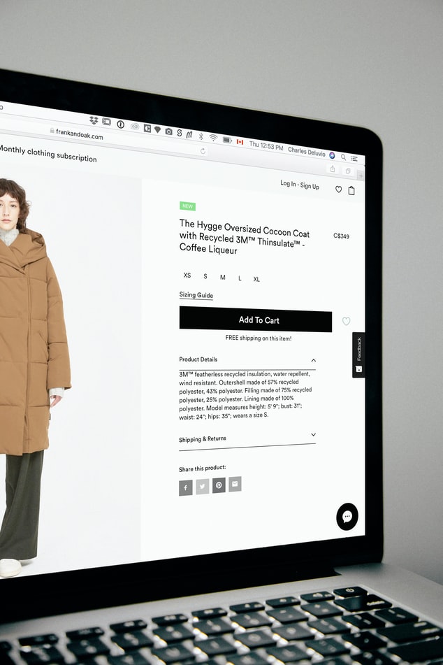 Matt: You may have, “Get 10% off this product now.” Okay, that’s still trying to drive them towards the product. If you then had something that said, “Check out our other products,” then it starts getting confusing as to, “Well, wait, am I here for this product, or am I just here to see a book of different products?”
Let’s just say, depending on the size of your landing page, you had five main calls to action.
Matt: If they’re all related around the same thing, as you go down, there is a psychology that’s going to build, because at the top, no, I’m not going to watch the video, but you get a couple scrolls down, you’ve seen this versus this, this pair of shoes versus that pair of shoes, and then maybe you get down to the third call to action, and it’s, “Use code this to get 20% off your first order.”
Well, that’s been building as you go and it’s still, “Buy the product, buy the product, see the product, see it in action, compare the product, buy the product,” but it’s not sending them in different directions where they’re not sure if they’re actually going to be able to buy the product off the page, or just view other products that you have.
Matt: So, the point is, is you don’t want to have conflicting goals and things that are going to take away from the main goal of having a form filled, having a purchase made, if that is the goal of the page. If you start just adding in links and goals just for the sake of having more stuff on the page, then you’re diluting your landing page.
Getting Cozy With Google Analytics

Bernard: Absolutely. There’re so many elements to consider how, I guess, a lot of our listeners are probably saying, “Well, how do I approach this? What do you recommend at National Positions for actually defining where the problem is? Is it the problem with my form?
Is it the problem on my calls to action? Is it a problem with my content being too dense?” There are lots and lots of very low-level decisions that need to be made, but how do you start from the macro perspective?
Where do we start in this whole conversion optimization process to make sure that we’re actually getting to work on what’s important?
Matt: Yeah. The first thing from a macro perspective, because I get that you’re going just in this last seven minutes, where like, there’s calls to action, there are goals, and it can get frustrating very quickly as they don’t know where to begin.
First, learn to love the metrics, learn to love the data, learn to love the numbers.
And what I’m getting at is, learn to love Google Analytics a little bit, just a little bit. Because I understand, I mean, early, early in my career, I was not a numbers person, and then as the years have gone by, you start relating those metrics to success and it becomes far more interesting.
So, first of all, if you don’t have Google Analytics set up on your account, or on your website, get that done.
Matt: You can search, you can find that it’s pretty easy. You can find a way to do that.
So, first, you want to look at that high level, the CA, where is traffic going on your site? And where is it not going on your site? Now, obviously you’re going to see your homepage, that’s going to have probably the majority of traffic, but you may have built 20 other product pages that are getting zero, because people either don’t know how to get there because of your usability, or the landing pages you have are not driving them there.
So, you just want to see what people are doing now. Not worry about what you want them to do yet, but just see like your top five or 10 pages where people are going, where they’re spending time.
That’s called time on site or average time on site, depending on your page, and see, are they spending them on specific product pages? Are they on a specific case study page? Or whatever it’s going to be.
 Matt: See where they’re spending the most time. Because if you know where they’re spending the most time, you know where you have the most opportunity.
If they’re spending a lot of time on a product page, but, wow, there’s no sales that have come off of that page—you may have done something as simple as forgot to say, “Click to buy now. Add to cart.” You may have made a wonderful product page without an action telling them what they need to do. So, that’s one of the first things is, find out where your traffic is going, and find out where they’re not going.
Because if you know where they’re going, and you know that they’re spending a lot of time on certain pages, you might be able to replicate that in your lower performing pages. You can look and see like, “Wow, all of these sites, they all have videos on them. Look at that. All of those high-performing pages have videos.”
Matt: So, can you replicate that on your lower-performing pages? And then also, you want to see where people are bouncing off your site.
Bouncing off your site means they get to a page, whatever that page may be, and they don’t take any actions, they don’t click a video. They just go, “Nope,” and they leave. Which means that, especially if it’s a ton of product pages, or it’s a page where you’re trying to get some information, something is turning them off very quickly, either you’re confusing them, or they’re just not clear as to what to do.
So, those are some of the first things that you should be doing.
Matt: I know there’s a ton of things you can do, but just high level, that’s where you should start, and then I’m sure we can get into, like Bernard said, every page should have a goal so you can make sure that you’re tracking conversions and tracking goals and all of this in Google Analytics, which, I mean, I’m sure that you have something to add on that.
Bernard: Yes. So, step number one is, I totally agree with you, get into Analytics, I can’t emphasize more how important it is to dive into the numbers and to look for those high traffic pages that have a high bounce rate, which is basically what you say, I’m just saying in a different way.
Have a look for those pages, those are the ones, besides your homepage, which is always something that you do want to optimize, but it’s more complicated.
So, those internal pages getting a lot of traffic but they’re getting a lot of people leaving, those are the pages to look at, and those are the ones to start working on and to create those experiments. But now, the next step is really to dive down on those particular pages and to identify what the problems are.
Identifying Real Customer Conversion “Friction”

Bernard: So, how do you approach that? You’ve been in Analytics, you’ve got to the point where you’ve identified, “This is where there’s a pain point, this is where there’s a problem. How can I now find out what’s getting those people to abandon or jump off or not do what we expect them to do?”
Matt: Yeah. Beyond using Google Analytics, one kind of a hardship about it is, you may be excited once you get in there, but you need to see where your benchmarks are in order to then go, “Okay, I’m going to make…” I’ll go over how you can find out some of this in a minute.
But you would then need to implement some changes and then wait to see what that does to the numbers, which can be just, oh, just heart-wrenchingly painful. But, a few things that you can do, one, within Google Analytics, of course, you can look at live on sites use actually on your site, but that doesn’t show you what they’re doing.
Matt: The only way you could see at a macro level what they’re doing, everybody, is going into your site flow in Google Analytics, which is fine, but what I would recommend is if you’re trying to see what’s working, what’s not working, what do people like and not like, there are several different, how should I put this?
Because I would say just heat mapping technology, but there are screen recording technologies that can record site sessions that come into your site. It doesn’t get any personal data, it’s not like, “John Smith did that.” It doesn’t show any of that. So, there’s no worry about infringing on anyone’s personal information.
But what you can do is, you can use these technologies to go in and see, at a high level, you can see a full page, and the system will actually be able to track where they’re spending most time if they scroll down and maybe you had a headline, and you’ll see it.

Matt: Just like you saw the old war movies from the ’80s, where it showed like, remember Predator? When it showed the heat? Same kind of thing.
It’ll show you what people are just skimming over, that’ll be in like blue, but then where people are spending a little bit of time either reading or looking at a video, or what they’re clicking.
So, that’s one way. The other way is, with that, that’s just the heat mapping part, but then you could have the screen recording part, where you can actually watch people scrolling down and you may see, wow, okay, they keep stopping here, but there’s, like, you may have a headline that says, “Check out our case study, badah, dah, dah, dah.” And you may have known, yeah, they should click over to the case study page, but you didn’t put a link in there.
Matt: So, they could be confused. So, those are just a few ways you can kind of spy on people who are coming in, to try to figure out how to make their user experience better. So, it’s better for them, and also so it will convert better. So, it’s better for you…
Ready to Keep Converting?
We know, it was just getting exciting! We have part two of this podcast ready for you and you can click here to go straight to part two. (Coming Soon)
Conversion is a heavy subject with so much to explore, test, and optimize so remember if you need some help figuring out where to begin, send an email to Marketing@NationalPositions.com with subject line “CRO” and we can create a custom report for you.
If you are driving traffic and you are getting clicks but you are not seeing the ROI, attention may not be your problem. Converting that attention is where you see the ROI.
Part two of this podcast picks up with understanding the user experience using heat mapping and screen recording technology. We know, its sounds like science fiction, but don’t worry…it’s just marketing!
