If you’re an eCommerce company, then conversion is extremely crucial for your success. It’s natural for visitors to put items in their shopping carts and never actually check out. If this happens more often than not, it can take a toll on your sales.
These are some helpful suggestions you should make to your website in order for visitors to follow through on purchasing items they place in their shopping carts.
Site Navigation
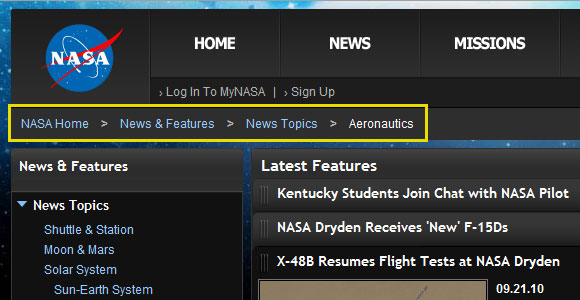
It’s important for visitors to know what part of your website they’re on when they land on a page. If it’s unclear, it could turn them away so that they don’t browse other pages. A breadcrumb trail allows visitors to keep track of which page of your website they’re currently on. They link back to each previous page on your website, making the user experience a breeze.
Contact
Even though you’re an eCommerce company, people still like talking on the phone to have questions answered or even to place an order. You should have your phone number clearly visible on each page of your website so that visitors have easy access to it if they need to contact you for any reason.
Product Page
In order for visitors to not be distracted or disillusioned by a cluttered or confusing product page, you should make them as simple as possible. This doesn’t mean that they shouldn’t be engaging, though. You want your products to stand out. It’s also important to have clear add to cart and checkout buttons that stand out from the rest of the text.
User Reviews and Content
You want to include user reviews on each product page so that visitors get a clear sense of what they are getting before they make a purchase. User reviews can change whether or not visitors make a purchase. If a customer is riding the line and you offer no user reviews, they might not be inclined to make a purchase.
Many eCommerce sites include manufacturer’s descriptions in the product details. You shouldn’t do this if you want your visitors to get a clear sense of what the item is. Detailed descriptions are great ways to inform visitors of what you offer.
Secondary Call-to Action
Sometimes a customer isn’t ready to make a purchase. This is when a secondary call-to-action can be helpful. If you offer them something like a virtual try-on, it offers them the chance to get a better feel for what they’re thinking of buying. They don’t have to commit to checking out just yet if they’re not ready, but they’ll get a better feel for what they’re thinking of purchasing.
Add to Cart Button
You want to make sure that your add-to-cart button doesn’t get lost with the other text on your page. If a visitor can’t find the button right away, they might not take the time to search for it. Make the button stand out so that it’s easily recognizable.
Dynamic Images
You want your products to stand out, so having clear images is important. By allowing visitors the chance to zoom, view different angles and various colors, they’ll be more comfortable with making a purchase. Obviously with an eCommerce site, the visitor can’t see the products firsthand, so you want to make them feel like they’re getting a clear sense of the products they’re looking at online.
Recommended Products
By suggesting certain products that visitors might like, it offers them the chance to browse other items you have. If you’re a retail site, perhaps you can offer them suggestions on what they can pair with certain pieces.
By performing these steps, you’ll make more likely for visitors to convert into customers.
