If you’re like most marketers, you’re hyper-focused on driving traffic to your website. That’s all well and good, but web traffic doesn’t mean much if it’s not leading to conversions.
You need an effective conversion optimization strategy—one that helps you get the results you need to grow your business—especially during the holiday season! Even small changes can bring big returns. Boosting your conversion rate by even one or two percentage points can translate into a huge increase in revenue.

So, how does your conversion rate stack up to the competition? Here are some stats, for comparison:
- The average website conversion rate (across all industries) is just 2.4%.
- Mobile conversion rates are even lower (around 1.53%).
- Meanwhile, desktop users convert at almost three times the rate as mobile users (4.14%).
- The highest average conversion rate by traffic source is paid search (2.9%).
- The top 10% of Google Ads advertisers have account conversion rates of 11.45%.
So, if you’re converting 2-3% of your web traffic, you’re doing about as well as the average ecommerce digital storefront. But we know you want to do way better than average.
That’s why we’ve pulled together a list of 9 proven tactics to help you boost conversions and sales. Buckle up, we are about to hit the gas!
Simplify your forms
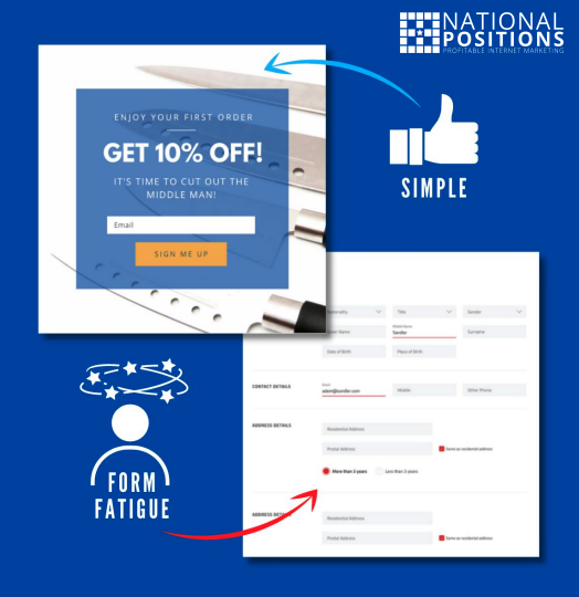 We’ve all abandoned an online form at some point because it was complicated or demanded too much information.
Don’t sabotage your conversion rate by asking for too much too soon. Reevaluate your forms and only keep fields that are necessary to accomplish your goal.
But don’t go overboard. A tidy online form could land you lots of leads, but those leads are useless (or at least less useful) if your sales team doesn’t have enough information to close deals.
Work with your team to find the sweet spot—and don’t forget your trusty old friend, the A/B test.
Get creative with offers and promotions
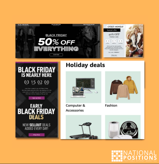 Discounts and free consultations can be effective, but they’re also cliché.
Unless you sell high-end products or services, standard offers like these can quickly lose their panache.
It’s time to get creative.
Get your team together for a brainstorming session on how to craft irresistibly compelling offers. Better yet, survey your customers/prospects/followers—find out what it would take to convert them from fence-sitters to paying customers.
Remember, testing is key when you are focusing on improving conversions and you don’t need to simply have blanket promotions. New customers, past customers, abandoned cart “almost” customers—try testing offers specific to your various audience types.
Create unique landing pages for different audiences
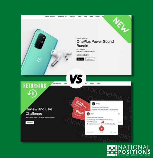 If you wouldn’t use the same ad on two very different audiences, why send them to the same post-click landing page?
Unless you sell an incredibly niche product, you’re going to have different audiences. Each of them will respond differently to headlines, offers, images, page layout, and persuasive styles.
Take some time to create buyer personas and build out separate landing pages. Make sure your copy addresses the goals, motivations, and pain points of each audience.
This can even mean providing a different experience for new vs. returning customers as each audience is going to be at a different point in their buying journey.
Highlight customer reviews and testimonials
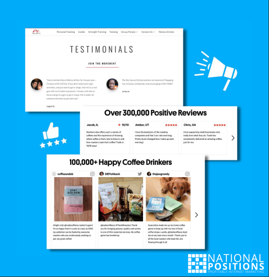 The majority of consumers (92%) don’t feel comfortable making a purchase if a website doesn’t have customer reviews. Only 8% of those surveyed said it doesn’t matter whether a site has reviews.
The lesson? You need to include social proof on your website. Reviews, testimonials, partnerships, even logos of brands you have worked with (if it fits your business model) are effective forms of social proof.
Your reputation is a huge factor in whether people buy your products, so link to Yelp and Google reviews or any other directory page where customers have left reviews about your business. Also include testimonials directly on your site—and make sure they’re highly visible.
Customers across the board are more likely to trust positive social proof from real-world customers than pretty much anything you say about your brand. It is the digital version of asking a friend or family member for a recommendation.
Live chat & FAQs
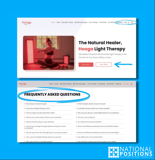 Don’t let prospects and customers leave your site because they have unanswered questions or concerns. Adding live chat to your site sends a message that you prioritize their needs.
Live chat empowers your customers to get information without having to navigate your phone system or wait hours (or days) for an email response. And getting questions answered right away just might be the nudge a visitor needs to convert.
If you have a product or service that takes a bit more education due to complexity or simply being new to market, a robust FAQ can be powerful.
How does the product work? Is there a satisfaction guarantee? How long does it take to get the results you are advertising? These types of questions are perfect for a dedicated FAQ section on your website.
Remember, every question in the mind of a potential customer is a reason for them to not convert, so use live chat and an onsite FAQ to put these questions to rest.
Remarket to cart abandoners
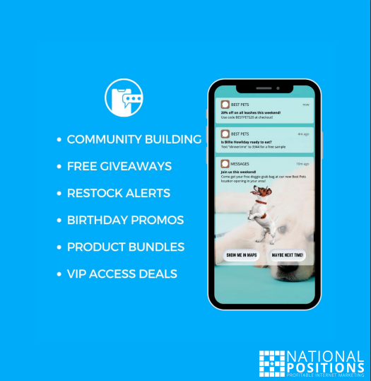 We’ve all hovered over the checkout button only to then abandon our cart for whatever reason. The phone rings, we get a message alert, or it’s time to pick up the kids from school. It’s incredibly common—more than two thirds of U.S. shoppers abandon their carts.
Don’t let these prospective customers slip away.
When a visitor leaves your site without completing their purchase, send them a follow-up email or SMS message with a friendly reminder of what they’ve left behind—along with an enticing offer.
Here’s what to include in your cart abandon email:
- Catchy subject line
- Brief opener
- Items left in the cart
- Offer or discount
- Checkout button or call to action (CTA)
- Reviews or social proof
Optimize your site for mobile
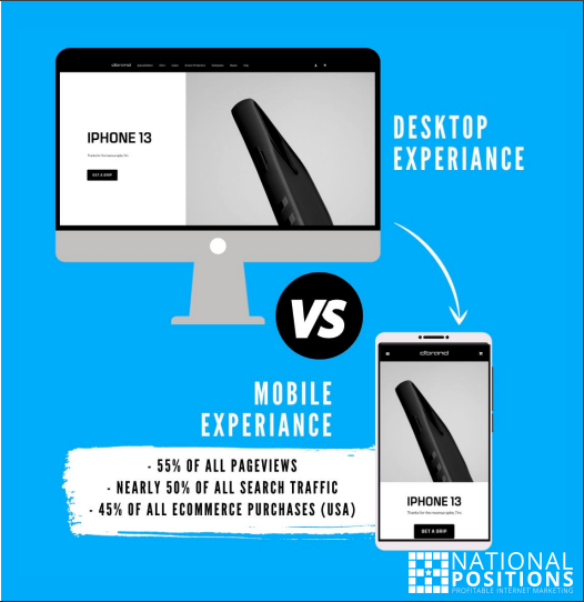 We mentioned at the outset that mobile conversions are painfully low—1.53%, on average.
Making your site mobile friendly not only makes it easier for prospects to click, download, or buy, but it also helps you rank higher, since Google switched to mobile-first indexing. “Mobile-first” means Google predominantly uses the mobile version of a site’s content for indexing and ranking.
To see how well your site performs on mobile, use Google’s mobile testing tool. The tool will tell you what you need to improve—like improving page speed or compressing images.
There is also an obvious difference in the way we use websites on our devices as opposed to desktops—this user experience cannot be overlooked.
Create a compelling value proposition
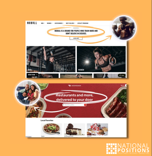 Make it crystal clear why a prospect should buy from you and not your competitors. What sets your product or service apart?
Spend some time reflecting on what makes your brand unique. It’s ok if you match your competitor on most points. In fact, it’s inevitable, given our hyper-saturated markets. You just need to pinpoint where you stand out in at least one key way.
Here’s how to create a compelling value proposition:
- Identify what sets you apart (features, value, service, etc.).
- Write out your value proposition.
- Keep refining it until you can sum up your value proposition in a single, succinct sentence.
- Use A/B testing to measure which message resonates most with your prospects/customers.
Maximize first impressions above the fold
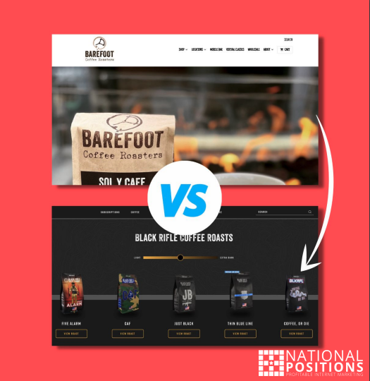 We can’t discuss the idea of conversion without touching on the subject of “above the fold.”
When a customer (new or old) lands on your site you only have seconds to convince them to stick around and keep scrolling. This is where the above the fold comes into play.
Above the fold refers to what a visitor sees on their screen when they land on your site. Your images, video, text, CTAs, and promotions are just a few examples. This should be an area of constant testing to see what has the most positive impact on those that are visiting your site.
Too much information can overwhelm a visitor and too little might simply confuse them, so you need to find the sweet spot that hooks them and inspires them to not “bounce” away.
Try featuring your best-selling product with an offer, a free trial if you provide a service, or even a video showing your product in action.
There are no hard and fast rules other than always be testing. This is especially true as the holiday buying season takes hold, and the competition for attention continues to grow.
Get Expert (Conversion) Help
To maximize your business and make the most of your online presence, you need to do more than drive traffic—you have to convert that traffic and turn site visitors into valuable customers.
This is where the conversion optimization pros at National Positions come in.
We’ll help you understand your clients, what motivates them, and what inspires them to convert into paying customers. We’ll show you how visitors move through your site, what friction points they are encountering, and more importantly, a plan for breaking down these barriers to conversion.
Ready for a fresh conversion optimization strategy? Send us a note or contact our team directly at (818) 740-4774.