The main goal of the majority of websites is to drive leads, sales, or some form of trackable conversion. Attracting your target audience and converting them into customers can be done using many clever strategies taking place on your website.
Conversion optimization is important for the success of these strategies. Visitors to your website usually need to be guided through a meticulously planned customer journey so they can become paying customers with as little friction as possible.
This is easier said than done. Often, websites can stumble when it comes to driving leads because of mistakes made to content or user experience aspects of the site.
We’ve collected five of the most common culprits when it comes to converting traffic into leads on a consistent basis. So make sure you’re not making any of these lead generation faux pas.
Unclear Value Proposition
A problem that many websites have is they don’t provide a clear value proposition.
How will visitors know that your business is the solution to their problem if you don’t make it crystal clear the second they land on your website?
When visitors arrive on your website, what value are you promising to give them? Is this promise of value clearly stated? If you only had three seconds of attention—what is the most valuable piece of information you would want them to know?
The customer experience can be challenging to get right, but when you’re making it obvious what value you offer, visitors are more likely to become customers. To ensure you’re getting this right, think of the most significant pain points of your visitors. Then, show how your business deals with those issues.
An example would be to dedicate your landing page to highlight the service (or product) benefits your audience can expect from you.

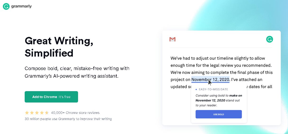
Grammarly’s home page is a fantastic example of how to provide a value proposition.
Notice the language is focused on what the customers care about first and foremost, “Great Writing, Simplified.” Grammarly surely knows that the value (internally) is in their AI tech, but the customer cares about the RESULT that they will get from this technology. #Winning
Confusing Website Navigation
The way your website is designed and laid out can greatly affect user experience and, in turn, the conversion rate. For example, if your website is difficult to navigate, not intuitive, confusing, etc., this will TANK your ability to build trust or convert leads consistently.
We have all been there.
We click on a site, our interest is piqued, and then we can’t find the product page, or compatibility information, or even a chat option to ask a question.
What do you do?
Well, you are likely to leave that site and check out a competitor who is more than willing to provide you the information you are looking for without any hassle.

Navigating this site…might be a bit of a headache.
Ensure that your website’s design is simple to navigate and that important information is clearly accessible with a click. We are in an instant gratification society, so make sure you are giving your visitors what they want ASAP. If you don’t make the user experience fantastic your customers are likely going to find a competitor that will!
Have a clear flow throughout your design to keep visitors engaged.
Poor Understanding of Target Audience
For success in the marketing world, you need a website that makes a good impression on your target audience. There is no point in goal setting and campaign planning if your web pages don’t cater to your audience.
If visitors don’t see content they can relate to or solutions to their problems, why should they hang around and become customers?
When you understand what potential customers want and need, you’ll give them a quality user experience, and they’ll spend more time on your website.mDo thorough research on your target audience. You can do that by knowing what matters to them and learning how they engage with online content.

On top of building personas, you can also have a better understanding of your audience by doing the following:
1. Personally Get To Know Your Customers
Getting to know the kind of people you will be offering your products or services to is a great way to know what they’ll want when online.
It’s recommended that you spend time getting ‘into their heads’ and walking in their shoes. Talk to them, get to know them individually, and understand them on a deeper level.
2. Keep Tabs of What People Do Online
Monitor what your target audience does on social media. Comments and engagements can reveal a lot about how they feel and whether they’re happy with a brand and its solutions to their problems.
Also, monitor how people are responding to your brand, and take note of what they’re saying about you. Likes, comments, and shares offer valuable insight into how your brand is received and liked by your audience.
3. Make Use of Surveys
If you need a straightforward way to get information about and from your target audience, surveys are a good option.
Ask people all the questions that will help you learn more, and make it easy to answer. It’s a quick and effective way to gather data and doesn’t have to take up too much of your time or a lot of effort.

This website is designed with the target audience in mind. Avengers playing cards anyone?!
Not Being “Mobile First”
Having websites that are not optimized for mobile use is a big mistake that must be avoided. In 2021 it is a top priority that your website can be viewed on multiple devices with no loss in quality.
Mobile devices account for about 50% of web traffic worldwide, so if your website can’t be viewed on a mobile device, you’re likely losing many valuable visitors.
If you had to guess, what percentage of ecommerce sales are completed on mobile devices? What about web visits? According to statistics, 70% of web traffic comes from mobile phones!

Also, 60% of internet usage happens on mobile devices and 61% of users will never return to a website that is not mobile-friendly. In fact, 40% of users will go to the competition after a bad experience. Mobile devices play a big role in ecommerce, up to 80% of shoppers use them inside of physical stores to look up product reviews and compare prices.
If your mobile website is not ready to be viewed by potential customers, you are losing out on a lot of business and lead gen conversion opportunities.
Complicated Checkout Process

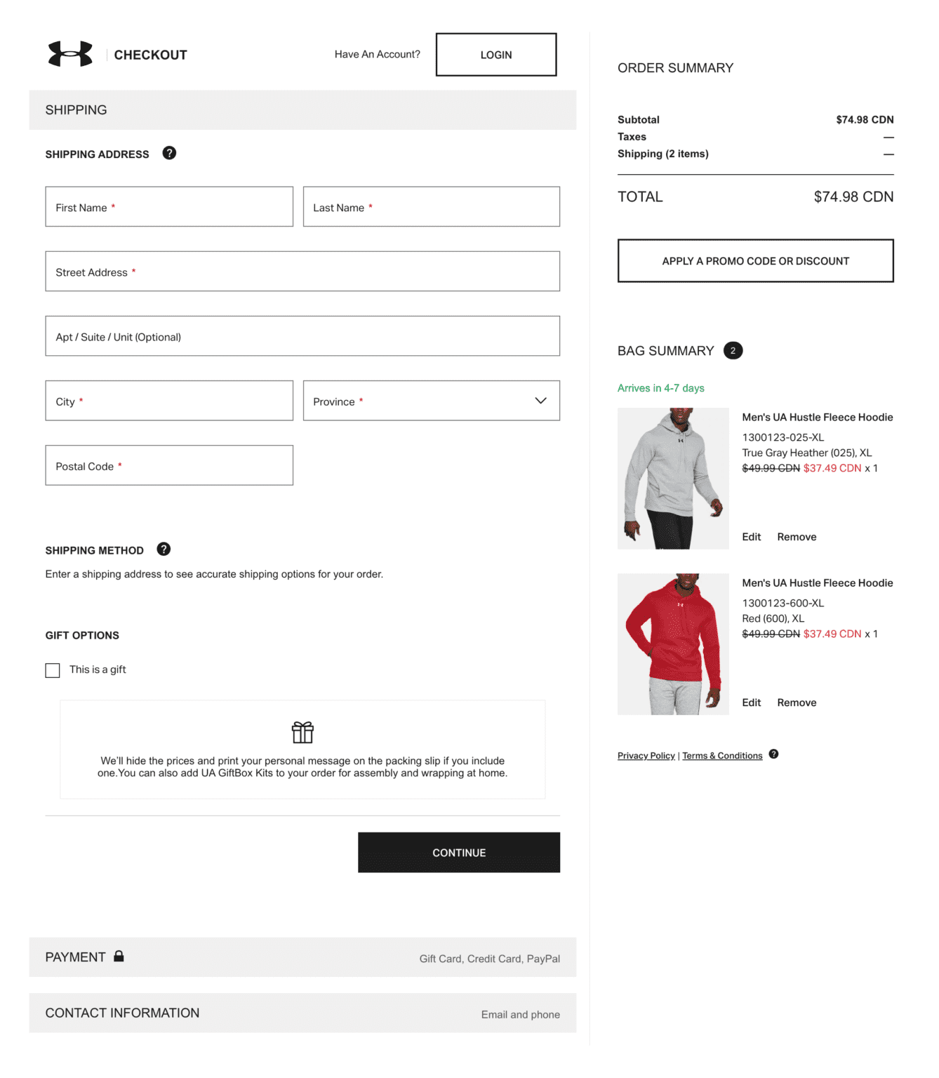
Many businesses lose customers at a crucial time: the checkout process. Cart abandonment is a regular thing, but it doesn’t have to be.
By improving the checkout process, you can increase your conversion rate by more than 30%.
Do not make the checkout process any longer or more involved than it needs to be. Your customers should not have to fumble through the process and get frustrated.
Keep things simple and easy to get done. Don’t ask customers to set up an account before they can buy from you. Let them pay and then use their email address to entice them into creating an account.
You only need your customer’s payment information, email address, and physical address. By asking for more than that, you’re making the process unnecessarily detailed.
Improve Lead Generation With Good Website Design
Take your visitors into consideration for every step of creating your website. If it’s not user-friendly and you’re making the mistakes we have outlined here, it’s time for a redesign.
It can seem daunting to design your website with all these factors (and more) in mind, so if you need some guidance, our team of professionals can offer some advice.
Simply click here, and we’ll get back to you ASAP, or call us at (877) 866-6699 today.