 When it comes to paid media marketing like Google PPC, Facebook Ads, or even YouTube Ads, all too often, clicks get the glory while the landing page gets overlooked—not necessarily by our prospects but by us!
Of course your ad campaign matters when it comes to driving attention to what you have to offer, but your landing page is what turns that attention into conversions. Landing pages inform, answer questions, and above all, build enough trust to entice your prospect to fill out your form, start a chat, or even pick up the phone.
Landing pages are an art form in and of themselves. And just like everything else in your campaign, to get the greatest return, you need to test these pages regularly, and you can start with these areas of optimization.
1. Thinking Above-the-Fold
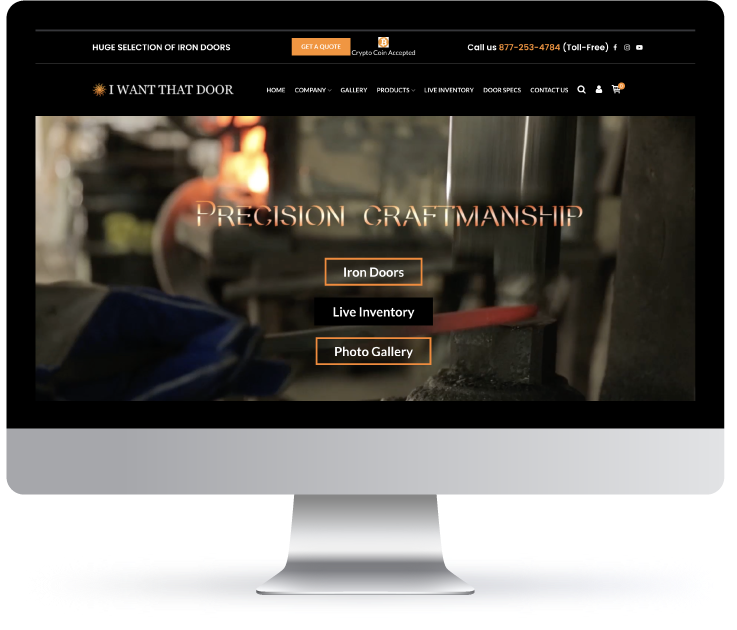
When we say “above the fold,” we are referring to everything the prospect will see on their screen before they scroll. Any images, forms, buttons, or text in this section are either going to entice them to scroll, click, or bounce off your page in the first 3-5 seconds.
As they say, “You never get a second chance to make a first impression.”

Images/Hero Image
The images you choose for the top of your landing page need to connect with your key demographic (i.e., your ideal customer). So, if you are selling designer sunglasses, your imagery needs to reflect this. Visitors should be able to look at your page (without text overlay or page copy) and know what your business is all about.

Continuing with the sunglasses landing page example, you could test images that show different frame styles, color schemes, gender-specific collections, even locations and settings such as a beach vs. urban cityscapes.
Consider diving into your analytics to get a better understanding of who is driving the most ad clicks (what gender, which ages, from which locations) to give you some additional testing ideas.
Differentiation Statement
This is a big one in a small package. In seven words or less, you should be able to answer this question: Why should a customer buy (or even consider) your product or service?
If a potential customer lands on a page, and the first text they see just says “cool sunglasses,” you might as well have said nothing. On the other hand, if the copy reads, “Designer Made. Custom Fitted. Half the Price.”—now you may be piquing the interest of the prospect.

There are no hard and fast rules for this, but you are trying to grab their attention. You want to interrupt the autopilot that many of us turn on while searching.
Over the years, we have seen some brands really push this boundary with phrases like “Stop wearing glasses that suck!” Bold? Yes. Thumb stopping? Yes. Effective? Well, it all depends on the voice of the brand, the target audience they’re trying to reach, and if this messaging is in alignment with everything else the brand is doing.
If a brand can check these boxes and test daring or flashy copy…more power to them!
When testing your “first impressions messaging,” here are some queries to take into consideration. What are the most frequently asked questions you get about your product? What is something you do that (to your knowledge) no other brand does? Then, turn these into statements to test, like the examples below:
– Quality: “Lenses that are 4x more durable than designer brands. Guaranteed.”
– Price: “Top Designer Sunglasses. All the Swag at Half the Price.”
– Fit: “Behold Your New Fashion Statement Now With Our ProFitGlasses App!”
Offers & Promotions
 Many would consider your offer or promotion the main event when it comes to your landing page. After all, when running a digital ad campaign you are trying to make the offer enticing enough to encourage your prospect to take action on the spot.
In fact, if your business has a high rate of repeat purchases, you can afford to make less on this initial conversion (with a really good offer) if it means additional purchases down the road.
So, be sure to have multiple offers ready to test on variations of your landing page: different products, various percentage discounts, unique promo codes, etc. Remember, what you think is the best deal might not resonate with your customers, so don’t put all your eggs in a single promotional basket.
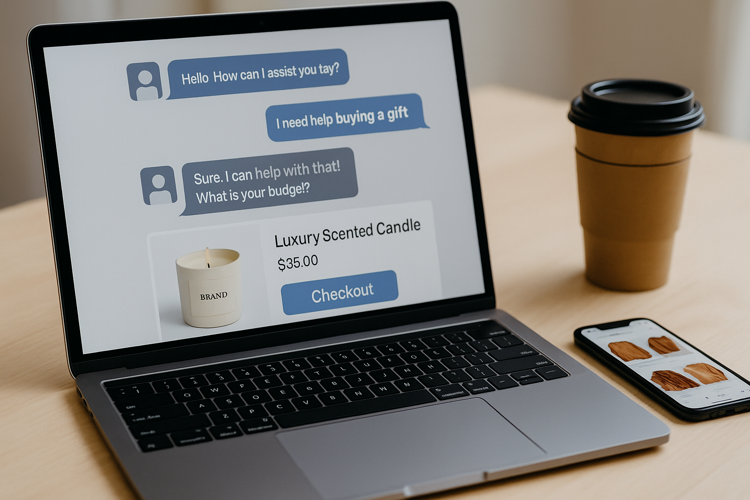
2. Forms & CTAs
 Call-to-actions tell (or inform) your prospects what they need to do, and the information they put into a form is the payment. So, what you are asking for with your calls-to-action must match the perceived value of the information your form is asking for.
Information is currency, and customers have become much more attuned to this fact, so you need to be testing how much information you are asking for so you can find the proper balance.
Make sure to test forms with various required (and optional) fields to see how much information your prospects are comfortable providing and what information causes the least amount of friction.
For example, your first form may have fields for a name, email, phone number, business name, street address, and notes. Your second form might just have fields for a name, email, and contact number. With the second form, you might not get all the info you want upfront, but perhaps you can collect this information later in the sales process.
We have all visited sites with ridiculously long forms, and the likelihood that you have filled out these forms is little to none. So be sure to keep yours within reason.

When it comes to CTAs (buttons or otherwise), test actionable language to see what moves the needle. Phrases like “Let’s Chat, Get Your Report, or Start Your Free Trial” all have actions attached to them that are directly tied to what you are asking for.
If you are still using “Submit,” “Submit Your Form,” “Send,” or “Complete” as CTAs, we urge you to stop. Not only is placeholder text like this ineffective, but it also implies that the prospect is simply sending you information and getting nothing in return.
3. Creative Assets
 Creative assets include any visual elements on your landing page: lifestyle images, videos, product shots, graphics, etc. As discussed earlier, all of your creative assets need to support your message and reduce buyer friction.
That being said, not all assets are created equal. Generally, landing pages with videos tend to outperform those without video. Images with people using or interacting with your product also tend to outperform those with product images alone.
If you are a service-based business or a B2B brand, a video that can explain what you provide in 60 seconds is going to be far more conversion-friendly than a page with 2,000 words trying to explain the same thing. Remember the 5-second rule?
Try substituting creative assets that can show what the written copy on the page is trying to say. Test where these creative assets are on the page, starting with your most valuable content (*cough* video *cough*) near the top.

Remember, landing pages are usually scanned with the eyes rather than being poured over to absorb information. Test what visual creative assets can help tell your story more effectively. We suggest using lead tracking software, like the National Positions Conversion Growth Pack, to see what is working and what is not.
4. Social Proof
 Finally, we come to one of the most valuable things to test—social proof. In short, social proof includes all the nice things that customers, other businesses, or publications have said about your business, products, and/or services.
Social proof can include, but is limited to, reviews (on Google, Amazon, social media, etc.), publications or articles, awards, industry partnerships, etc. Even adding something like a series of quoted reviews (or video testimonials) can be a huge game changer when it comes to your landing page performance.
Consider how often you look at the reviews on an Amazon product before you make a purchase. Well, putting social proof onto your landing page can add a level of trust that your customer would otherwise need to go seek out themselves…elsewhere.

5. N.S.T.—Never Stop Testing
While there is a lot to consider when it comes to testing your landing pages, here is one thing to remember above all else: Don’t try to test EVERYTHING at once!
Testing too many elements can work against you. First, because there can simply be too many elements to address at one time. But more importantly, if everything is different you won’t know which changes are providing the results.
Was it the form length? That above-the-fold CTA button? Or could it have been that video you added? In short, test a couple of things at a time and continue to test regularly. Soon enough, you will have a landing page that is paying dividends!
If you need additional ideas (or assistance) ramping up your landing page conversions – drop us a line and our experts can get to work building your landing page conversion strategy. Click here to send us an email or call us today (818) 918-5188.